Best charts to be used in Data Analysis | Best charts for Excel
Best charts to be used in Data Analysis
You have a variety of options with data analysis / excel to present your data in the most appealing ways. There are various chart kinds that can be used for your objectives. You can make a chart based on the type of data and your professional needs. Charts make information easy to understand, compare, and analyse because they clearly show a set of connected data.
The characteristics of a good graph in Excel are:
- Visually explain the values or data that we want to analyze
- It should be self-explanatory and easy to understand
- The graph’s content should be explained through legends
- It should be immaculate, without elements or colors that generate distractions
Types of Charts in Excel
Choosing between the different types of charts in Excel to display information correctly is essential. Each chart type presents data differently, the choice of the chart should be planned correctly.
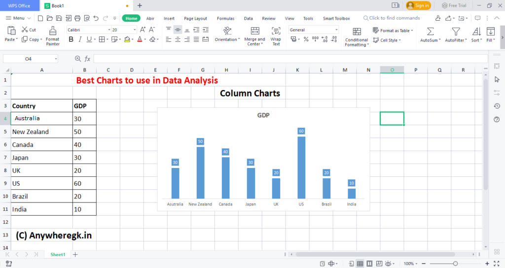
Column chart
This type of graph emphasizes the variations of the data over time. The data categories will appear on the horizontal axis and the values will appear on the vertical axis. Column charts are similar to bar charts. The main difference is that in bar charts, the categories appear on the vertical axis.
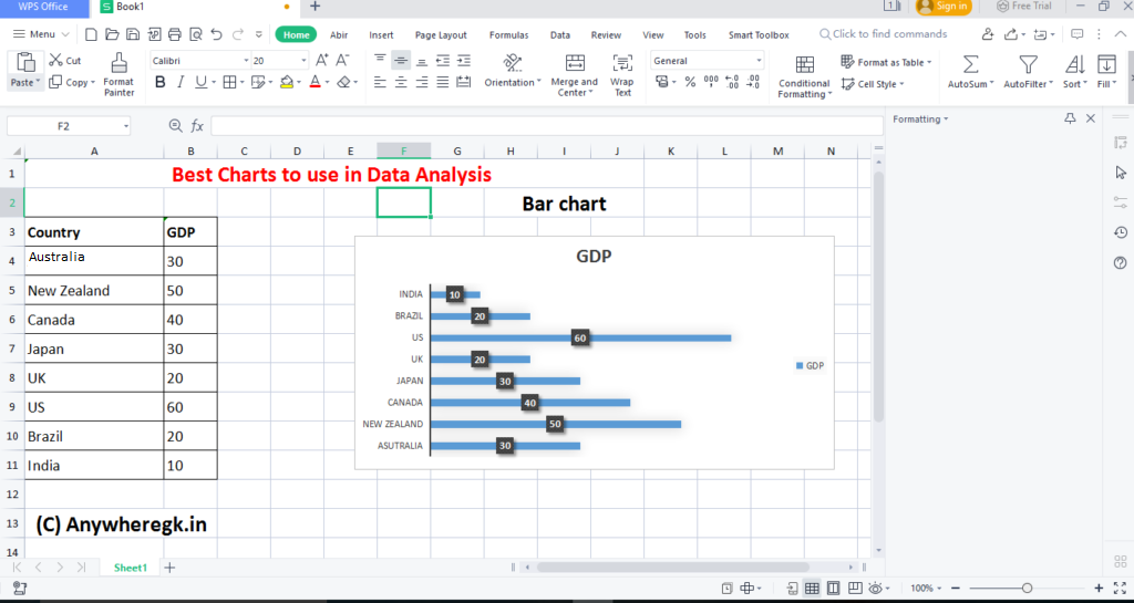
Bar Chart
A bar chart emphasizes the comparison between items in a specific period. This chart type includes cones, cylinders, and pyramids.
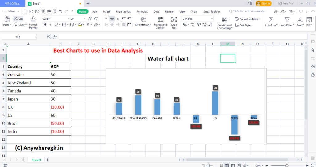
Waterfall chart
You can create a waterfall chart for analysis of the evolution of a variable in data of the period and accumulated data. The following example talks about the net income of a company. The Waterfall chart is color-coded in Blue and Orange. Here orange denotes the amount spent and blue denotes the revenues earned, and the overall profit made by the company.
Enroll in our Advanced Data Analysis Courses

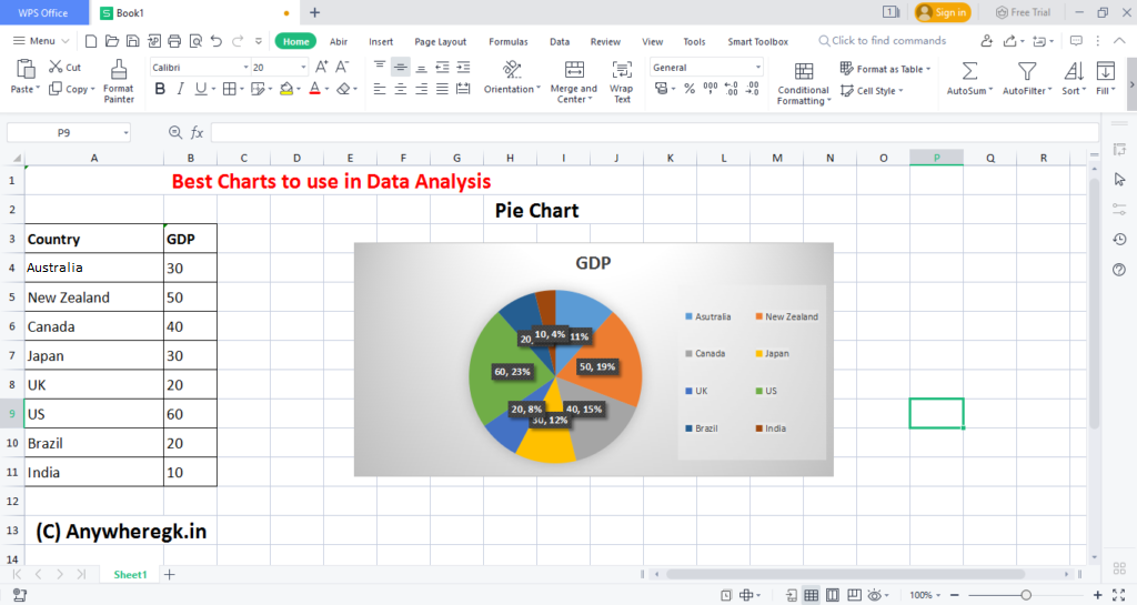
Pie chart
A pie chart chart allows you to display hierarchical data in the form of a circle. Each data is displayed in a ring, with the inner circles being the hierarchy superior to the outer circles.
Enroll in our Advanced Career Gift packs

Visit here for our Youtube channel : Click here
Like & Follow us on Facebook: Click here
Like & Follow us on Instagram: Click here
Like & Follow us on Linkedin: Click here